Thursday, 17 December 2009
Thursday, 26 November 2009
Tuesday, 17 November 2009
Thursday, 12 November 2009
Thursday, 22 October 2009
College Magazine Contents Page
 Finally, I used the filter- Extract tool again to grab a print-screen'd font off dafont.com, re coloured it, and resized it to fit in the top left corner. Next to this I placed a manipulated image of brick work, not dissimilar to the image of brick work on the front cover of this magazine.
 Then imported to images of students, i cut them out using the filter- Extract tool which can be really helpful as well as the magic wand tool and magnetic lassoo etc. I also used the box tools to give a border effect and then used the vertical type tool down the left hand side border.
 I started out with a simple gradient...
My first initial idea, presented by sketch and influenced by the magazine covers below:

These are magazines that I came across that really inspired my magazine front cover:
 On this cover, the thing that stood out to me was the purple, digital, abstract design done in graffiti style which gives the magazine an urban, 'street' look, which is what I want to achieve with my magazine.
 This magazine stood out to me because of the mast head, I just loved the colours used, the font and the way it is related to the skyline, it is brilliant as it is vibrant, colourful and very eyecaching, exactly what I want to achieve with my own.
College Magazine Cover
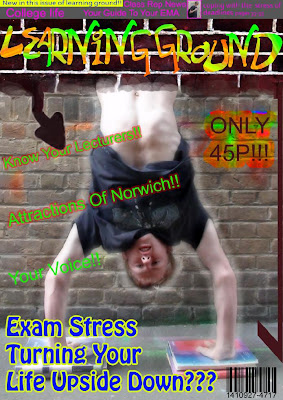 Finally, I added the cover lines, price, barcode and the main cover line, suitable to the picture; ''Exam Stress Turning Your Life Upside Down???".
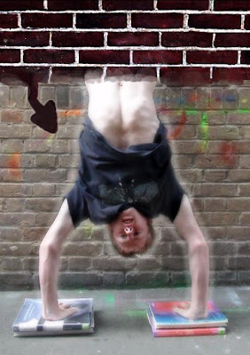
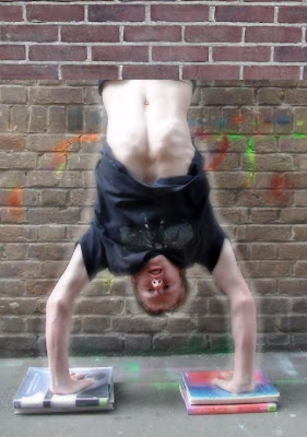
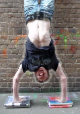
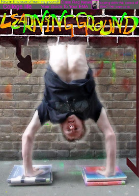 At this point, since the mast head was in place, I decided to start working on the sky line, and I also added a vertical arrow, which went well with the image of me upside down.
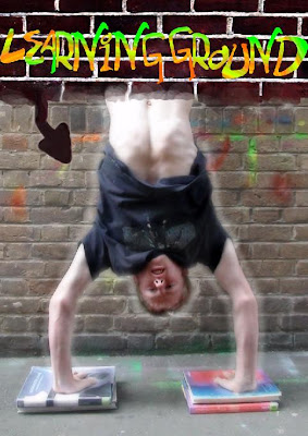 After saving it on my pen drive, I took it home and designed the mast head using a wacom board that I have for my home computer so that I could literaly draw the text by hand myself.
Tuesday, 6 October 2009
Thursday, 1 October 2009
 After I had "finished" the back of the CD cover, I looked back at my work and decided there were still afew adjustments to be made. first of all I moved the text at the top and the bottom of the cover inwards a little, to prevent them being cut off atall during printing.I also used the clone stamp tool to erase the bars which were still in front of the image of me standing with my hood up. I then moved the figure, leaving a grey hole asif he had been 'cut out'. The final alteration I made was moving the barcode to a more suitable place and changing the colour of it to make it more realistic.... This, is my final CD back cover.
Tuesday, 22 September 2009

Finaly i used the burn tool to make the text more readable and inserted a barcode too

I have now used the text tool again to actualy write the tracks in and used the free transform to angle them how I want, after rasterizing, i used the burn tool on them to stlyize them a little. Also I created a circle around the 'ND' to imply it is some sort of a symbol.

Here I added some more text which relates to the front CD cover. Also I inserted the image of me from the front cover by using the very useful extract tool.

I then loaded up another photograph of some bricks i had taken, by altering the contrast Iturned it into a black and white image, then I used the vertical type tool for the track numbers. After I had done that I used the magnetic lasoo selection tool to roughly select the numbers and some of the brick behind them. I then used colour balance to alter the colour greatly.

I have now used the text tool again to actualy write the tracks in and used the free transform to angle them how I want, after rasterizing, i used the burn tool on them to stlyize them a little. Also I created a circle around the 'ND' to imply it is some sort of a symbol.

Here I added some more text which relates to the front CD cover. Also I inserted the image of me from the front cover by using the very useful extract tool.

I then loaded up another photograph of some bricks i had taken, by altering the contrast Iturned it into a black and white image, then I used the vertical type tool for the track numbers. After I had done that I used the magnetic lasoo selection tool to roughly select the numbers and some of the brick behind them. I then used colour balance to alter the colour greatly.

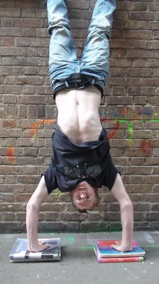
I started off with the original shot of
 me in an urban environment.
Next I used levels, curves and the burn tool to simply manipulate the colours used.
Here I began to manipulate the background layer using the bucket tool to fill it with solid black.
After filling the background layer with solid black with 100% opacity, I then created a new layer on top of that and loaded a photograph of a wall I took onto it, once loaded I knocked the opacity down to around 40% in order for the solid black fill to show through.
Here I simply inserted text for the title that I named "THE URBAN DISTRICT", which seems appropriate for the image I had created for the cover.
Subscribe to:
Comments (Atom)
