College Magazine Research Powerpoint
View more presentations from ryan lovejoy.
 Finally, I used the filter- Extract tool again to grab a print-screen'd font off dafont.com, re coloured it, and resized it to fit in the top left corner. Next to this I placed a manipulated image of brick work, not dissimilar to the image of brick work on the front cover of this magazine.
 Then imported to images of students, i cut them out using the filter- Extract tool which can be really helpful as well as the magic wand tool and magnetic lassoo etc. I also used the box tools to give a border effect and then used the vertical type tool down the left hand side border.
 I started out with a simple gradient...
 On this cover, the thing that stood out to me was the purple, digital, abstract design done in graffiti style which gives the magazine an urban, 'street' look, which is what I want to achieve with my magazine.
 This magazine stood out to me because of the mast head, I just loved the colours used, the font and the way it is related to the skyline, it is brilliant as it is vibrant, colourful and very eyecaching, exactly what I want to achieve with my own.
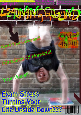
 Finally, I added the cover lines, price, barcode and the main cover line, suitable to the picture; ''Exam Stress Turning Your Life Upside Down???".
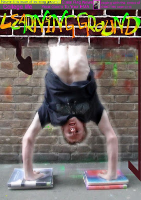
 At this point, since the mast head was in place, I decided to start working on the sky line, and I also added a vertical arrow, which went well with the image of me upside down.
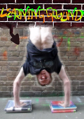
 After saving it on my pen drive, I took it home and designed the mast head using a wacom board that I have for my home computer so that I could literaly draw the text by hand myself.
 After I had "finished" the back of the CD cover, I looked back at my work and decided there were still afew adjustments to be made. first of all I moved the text at the top and the bottom of the cover inwards a little, to prevent them being cut off atall during printing.I also used the clone stamp tool to erase the bars which were still in front of the image of me standing with my hood up. I then moved the figure, leaving a grey hole asif he had been 'cut out'. The final alteration I made was moving the barcode to a more suitable place and changing the colour of it to make it more realistic.... This, is my final CD back cover.